The accurate prediction and diagnosis of diseases is at the forefront of challenges that need to be addressed by medical professionals. This is a complicated task due to the myriad of factors that can contribute towards an ailment. In the United States, heart disease is the leading cause of death in the population with 696,962 deaths reported in 2021 (1 in every 5 deaths). https://www.cdc.gov/nchs/fastats/heart-disease.htm. As such, it is imperative to understand the causes and factors that lead to this deadly disease.

In this project I'll be showing how machine learning classifier models can be trained and used to predict heart disease. The dataset I'll be using here is the Heart Disease Dataset that I extracted from the UC Irvine Machine Learning Repository found here: https://archive-beta.ics.uci.edu/ml/datasets/heart+disease. This dataset contains databases from Cleveland, Hungary, Switzerland, and the VA Long Beach with each containing 76 different attributes of categorical and numerical types. This data was collected by the following institutions back in 1988:
- University Hospital, Zurich, Switzerland
- University Hospital, Basel, Switzerland
- V.A. Medical Center, Long Beach and Cleveland Clinic Foundation
Exploring the Data
This dataset has a healthy mixture of numerical and categorical variables. As such, it was necessary to make modifications in order to facilitate their usage in the feature selection and modeling process. If you would like to see my process of preparing the data you can check out my post here or my repository here. For now I'll simply include the pandas_profiling report on the cleaned dataframe.
Since this is a classification problem, the first thing to note is that the ditribution of diagnosis classes in our dataset is spread quite evenly. Therefore, we don't have to worry about a scenario of unbalanced binary classification. The next thing to note is that these are a lot of variables to work with! Though having more features to our model can make them more accurate, it also makes them less exaplainable (known as the curse of dimensionality). Machine learning models often suffer from this lack of explainability, and are treated as black-box models which can make it difficult to formulate and convey actionable insights from the model results. In other words, having too many features in our model makes it less interpretable.
As such, I like to err in the direction of starting my models with less variables/dimensions if a good accuracy score can still be attained since then I can more easily explain what my model is actually doing. The process of eliminating these unwanted and/or redundant features in our data is known as dimensionality reduction.
Feature Selection through Dimensionality Reduction Via Chi Squared Test
There are many techniques that can be used to carry out dimensionality reduction that fall into the category of feature selction or feature extraction. feature selection. In this case, I'm interested excluding attributes that are present in the data. I'll do this through the Chi Squared Test which is type of filter method.
The null hypothesis for the chi2 test is that two categorical variables are independent. Therefore, a higher value of the chi2 statistic means that two categorical variables are dependent and are thus more useful for classification. In other words, the highest chi squared values will represent the strongest relationships between our dependent variable (the diagnosis) and our independent variable and should therefore be the ones that we should focus on during the model development (at least initially).
I applied the Chi Squared Test on the data and chose the best 10 features. The results of this process are shown in the table below.
I will now generate a new dataframe that uses these variables now. These will be the 10 independent variables that I will use to predict whether there is a positive or negative diagnosis of heart disease.
The pairplot below also helps us readily identify trends that I could analyze further between the numerical variables as well as give us an idea of how certain variables are likely to contribute towards the prediction of heart disease from the model. The colors designate whether a patient will have heart disease (blue = yes, orange = no).
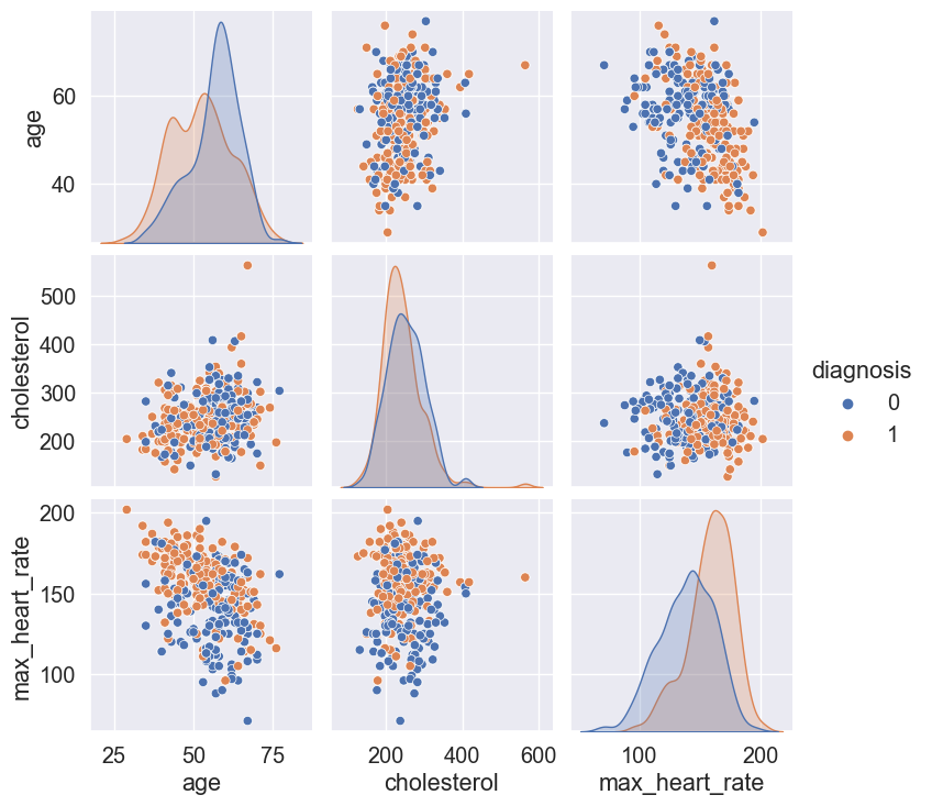
For instance we can see that age and max_heart_rate have an approximately negative linear relationship.
It can also be seen that the lower the max_heart_rate the more likely the patient will have a positive diagnosis of heart disease. There is evidence in the literature for this to be true, since max_heart_rate in this case corresponds to the heart rate achieved after exercise.
It can also be seen that a positive heart disease diagnosis is more frequent with increased age.
With this understanding of the variables and having reduced the dimensionality of the dataset such that the model will use the most 10 most important features based on the Chi Squared Test, I will now turn my attention to building and testing a set of classifier models.
Building and Assessing the Performance of the Classifier Models
I'll split my data using the 80/20 Pareto principle to start things off. Then, I'll test out the following classifiers with their default parameters and see how well they perform.
- Linear Perceptron
- Gaussian Naive Bayes
- Random Forest
- Extreme Gradient
- K-Neighbors
- Decision Tree
- Extreme Gradient Boosting
- Gaussian Process
- Support Vector
- MLP
The results of the models are shown below:
Very nice! The Random Forest Classifier and the Extreme Gradient Boost (XGBoost) Classifier performed really well straight from the box! They both achieved accuracy scores of 0.9854 which is excellent. Their sensitivity and specificity are both 0.9714 and 1.0 respectively. Since their performance is equal, I decided to go for XGBoost since it is generally a better performing and efficient algorithm than Random Forest.
Optimizing and Cross Validating the XGBoost Classifier via Parameter Search Exploration
The performance of the XGBoost classifier is already really good. However, it won't hurt to improve it even further through a parameter space exploration. There's quite a few parameters at our disposal to tune for XGBoost which you can find in the documentation.
I decided to explore and optimize the following parameters and see if an even better performance can be achieved:
- learning_rate
- max_depth
- n_estimators
In addition, to exploring parameter space, I also applied a k-fold cross-validation with k=5. Cross-validation is an important aspect of model testing and optimization since it can help in the detection of overfitting and selection bias problems. In other words, cross-validation is a good way to assess how generalizable the model is.
I've included a neat visualization of the grid search exploration results below. The 3D scatter plot below shows the accuracy scores obtained from the various combinations that I explored through the grid search. The color scale represents the accuracy score (purple is low and light green is high). The size of the spheres represents the standard deviation of the generated model (small sphere means low variance and big sphere means high variance). Therefore, the best model is the sphere with the lightest green color and the smallest size.
The results of the parameter exploration resulted in an accuracy score of 1.0 which is better than what I had before. In addition to the improvement in the classification accuracy of the model, this model was also obtained by cross-validation which makes the model performance more reliable. The final parameters are:
- learning_rate = 10
- max_depth = 11
- n_estimators = 130
The confusion matrix for this model is shown below. The confusion matrix is a good way to track the number of false/true negatives/positives classifications that the model is generating. From it we can see that there are 96 true positives, 109 true negatives, 0 false negatives, and 0 false positives. This is great! The lack of false negatives is particularly thrilling since in this particular application, a false negative would result in the neglect of the condition which would be bad news for the patient.

ROC-AUC Curves of Model
Let's now look at the Receiver operating characteristic curve (ROC curve) and the area under the curve (AUC) for this model. ROC is a probability curve and AUC represents the degree or measure of separability. The Higher the AUC, the better the model is at distinguishing between patients with heart disease and no heart disease. An excellent model has AUC near to the 1 which means it has a good measure of separability. A poor model has an AUC near 0 which means it has the worst measure of separability.
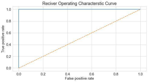
The AUC for this model is 1.0 which means that the model has a high degree of separability which is desired.
Understanding the Classifier Decisions
The generated model is performing really well! However, does the decision making process that the model is using to make a diagnosis make sense? Let's try to get a better understanding of how our classifier model is making the decision to diagnose heart disease. I'll be first using the ELI5 package to see the weights that the different features of our model have when making a heart disease diagnosis.
Interesting, the top 5 features that contribute towards the heart disease diagnosis decision are as follows:
- cp_typical_angina
- num_major_vessels
- st_depression
- max_heart_rate
- cholesterol
These all make sense at a glance. Let's look at them deeper to better understand their behavior firstly through Partial Depdence Plots
Partial Dependence Plots - Feature Effects On Model Prediction
In PDPs, a single variable is varied in a single row across a range of values in order to see what effect it has on the outcome. It does this for several rows and plots the average effect. Below are the PDPs for the features with the largest weights towards a diagnosis of heart disease. Therefore, if the PDP is positive then that feature contributes towards a positive heart disease diagnosis, if it's negative it contributes towards a negative heart disease diagnosis.

From the PDPs we can see the following:
- Having a positive result for typical angina decreases the probability of heart disease
- As the number of major blood vessels increases, the probability of heart disease decreases.
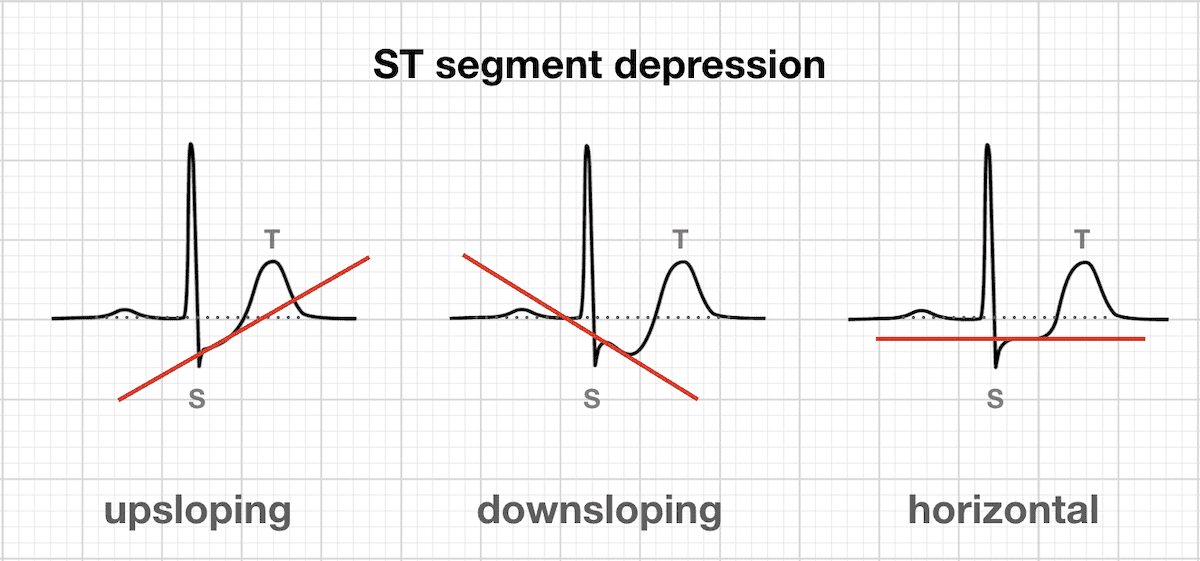
- As the slope of the ST depression in the ECG goes from upsloping to downsloping, the probability of heart disease decreases
- The probability of heart disease is non-linear based on heart-rate and cholesterol
The dependence on having a typical angina makes sense. Angina is a type of chest pain caused by reduced blood flow to the heart. There's different types of angina (stable , unstable, variant and refractory). Typical angina is common and is generally experienced during periods of physical exertion and usually goes away before long. The PDP for typical angina shows that when a patient exhibits this condition the likelihood of them having heart disease goes down which makes sense.
The dependence on increased number of vessels seen in fluoroscopy also makes sense. If more vessels are seen during this measurement, then it is indicative of better blood flow and suggests a healthy heart. This is indeed what is observed in the PDP plot for this feature.
The dependence seen for the ST-segment depression is tougher to interpret because there are other factors that are needed from the ECG to get a fuller picture of the situation. However, the PDP plot suggests that as the slope of the ST-segment goes from having a postive slope to a negative slope, the probability of heart disease decreases.
We can also look at 2D-PDP plots to get information about how the interaction between variables contributes to heart disease. The 2D PDP plots below will show the interactions between the typical angina feature and the next top 4 features in the mdoel. The color scale in the plots below represents the probability of a heart disease diagnosis. Blue colors mean lower probability of heart disease while red colors represent higher probability of heart disease.
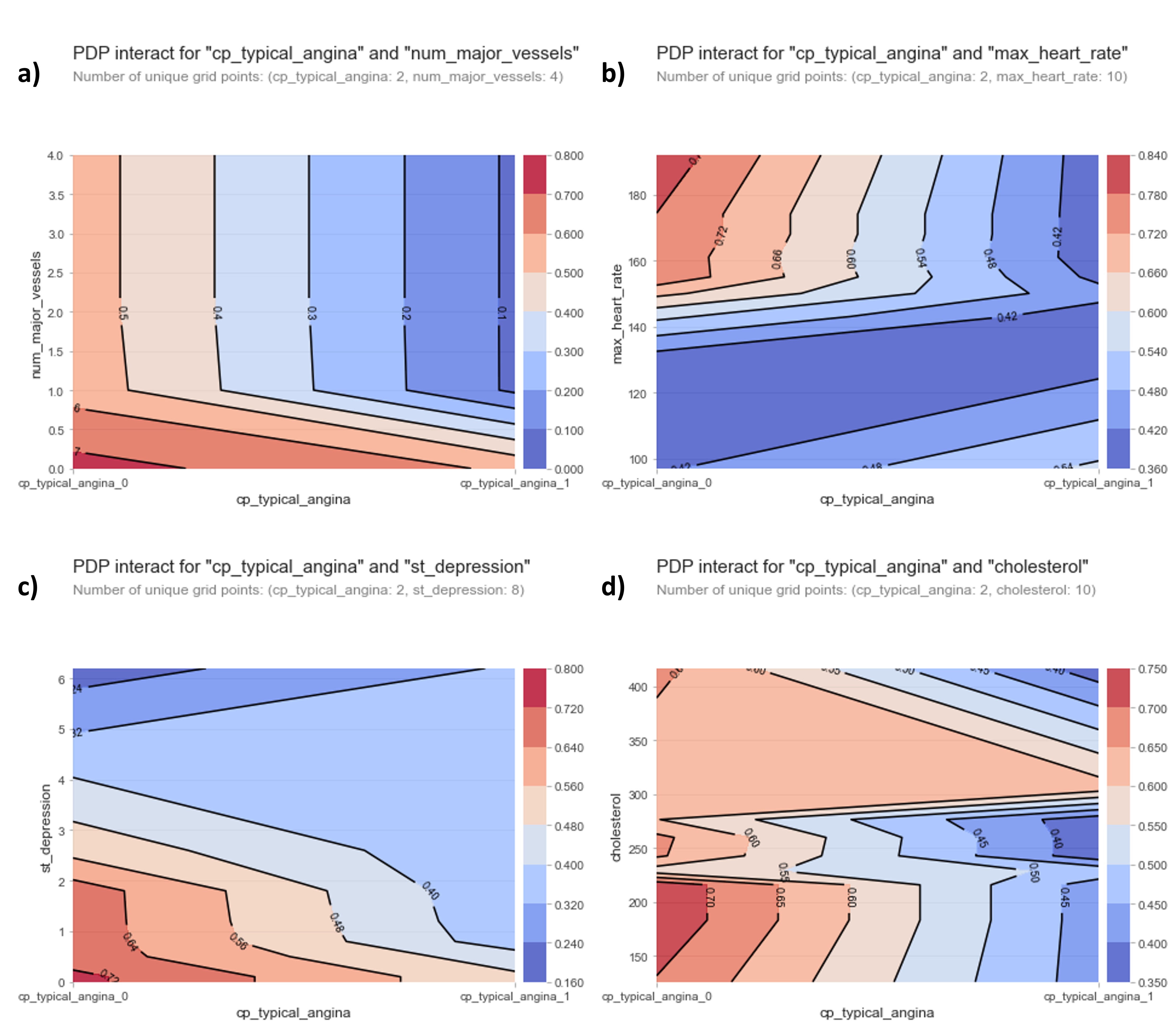
From the plots above we can see the following:
- Having no blood vessels show up in fluoroscopy AND not having a typical angina results in a high chance of heart disease
- Having a high heart rate AND not not having a typical angina results in a high chance of heart disease
- Having an upsloping ST-segment AND not having a typical angina results in a high chance of heart disease
- Having low cholesterol AND not having a typical angina results in a high chance of heart disease
Hmmm, the first three interactions between the typical angina diagnosis with the fluoroscopy results, heart rate measurements and the ST-segment make sense based on literature reports. However, low cholesterol having a higher probability of heart disease doesn't seem to be in agreement with the medical consensus of high cholesterol levels being a high-risk factor of heart problems. Why could this be?
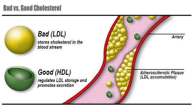
This strange behavior could be explained by the fact that the cholesterol levels reported in this work appears to be the TOTAL serum cholesterol levels. Cholesterol actually travels in two different types of lipoproteins known as low-density lipoproteins (LDLs) and high-density lipoproteins (HDLs). High LDL levels are associated with increased risk of heart disease. High HDL levels on the other hand are associated with lowered risk of heart disease. The data from this project doesn't separate between those two types of cholesterols which would explain the strange behavior of cholesterol seen here.
SHAP Values for Assessment of Contributions of Model Features
Let's look at the Shapley Additive Explanations (SHAP). SHAP is a method from game theory that can help explain the outputs from a machine learning model. More specifically, these SHAP values allow us to understand the impact from each feature in our model by breaking down the predictions made by the model. It's important to note that SHAP values are not a model assessment criteria. In other words they don't evaluate the quality of the model. They are here to help us understand the importance/contribution of each feature in our model.
The plot below shows the summary of the SHAP values for each of the features in our model. The features are arrange in descending order of importance. The colors represent the extent to which each feature contributes towards the heart disease diagnosis (more pink means more contribution towards heart disease while more blue means more contribution towards no heart disease) for each patient in the test set.
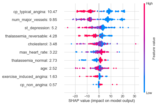
Some of the things we can see from this plot are:
- A high positive contribution is obtained for typical angina when the SHAP values are low.
- A high positive contribution is obtained for number of major vessels when the SHAP values are low
- A high positive contribution is obtained for ST-depression when the SHAP values are low
The plot below is a SHAP force plot for the 205 patients that make up our test set. The x-axis is patient ID and the y-axis is the SHAP score for every patient. It gives you a breakdown of the SHAP values for every patient which allows you to see how the model decided on the heart diagnosis. It's interactive so give it a look!
Final Predictions
Great! Now we have both a model that has high classification accuracy AND have a much better understanding of how our classification model is working. Now I can apply the model to the entire dataset and see how it performs. The results are shown below for the 1205 patients that make up this dataset:
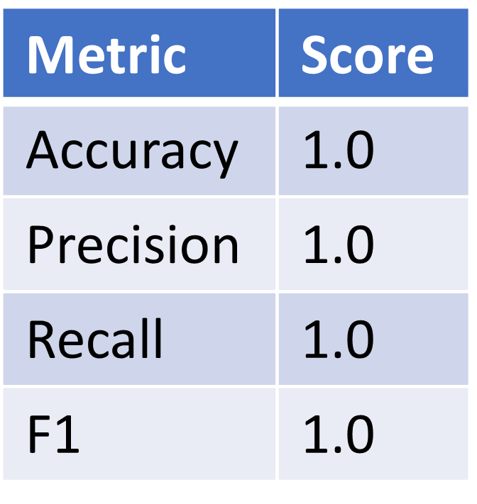
Our model performed excellently over the entire dataset! It correctly diagnosed heart disease for every patient. I've also included the SHAP force plot for every patient in the dataset below in case you are interested in seeing how the diagnosis was made for every patient.
As impressive as these results are, I do want to mention that the dataset I'm working with is quite old (data is from 1988) and a lot of advances have been made in the field of medicine since the time this was published. In addition to this, the dataset could benefit from additional information for each patient like demographic information and increased specificity about some of the quantities (like differentiation between LDL and HDL cholesterol). Lastly, having an even larger sample size would increase the veracity of the model since after all, a model is only as good and useful as the data that we provide it with.
Conclusions and Final Thoughts
The goal of this project was to test, optimize and use machine learning classifiers to predict whether a patient will be diagnosed with heart disease.
The dimensionality of the model was reduced using the chi squared test so as to include 10 features.
The XGBoost Classifier produced the most accurate predictions out of the 10 classifiers that were tested. After a parameter grid search and cross-validation, the accuracy, precision, recall and F1 scores were optimized to obtain 100% classification accuracy which is excellent even after validation on the entire dataset.
The ROC curve and the AUC showed that the generated model has high separability which allows it to readily distinguish between the two types of heart disease diagnosis.
The 5 most important factors towards the diagnosis of heart disease from the model were determined to be a typical angina diagnosis, the number of major blood vessels that show up in fluoroscopy, the slope of the ST-segment depression, the maximum heart acheived after exercise, and the cholesterol levels.
Partial Dependence Plots and SHAP values were used to better understand the considerations the model is making towards making an assessment of heart diagnosis
This was an interesting project to tackle and I'm looking forward to the next data question I'll try to address! Thanks for reading!